Brand
Twin Browser logo and brand assets
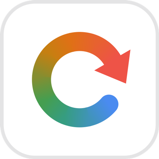
The mark is a rerun loop: one ribbon coming all the way back round to its own start, with an arrowhead closing it. That is the product’s mechanism — compile a task once, then replay it — and the gradient travels around the ribbon in the direction the work flows. Everything here is free to use when you write about or link to Twin Browser.



Variations
Pick the version that fits the ground
The colour mark wants a ground it can separate from — white, near-black, or a quiet photograph. On anything multi-coloured the four hues each collide with something behind them, and the one-colour knockout is the correct mark there rather than a compromise. Reverse nothing by hand; the file you need is below.












Icon sizes
For slots that ask for a pixel size and nothing else. All transparent except the 120, which is flattened because a consent screen composites onto a ground of its own choosing.
Backgrounds you don’t control
Three logos, one hostile ground
A screenshot, a hero photo, a conference slide. The ground below is deliberately unhelpful — a bright patch, a dark patch and a blue patch — because a logo that survives it survives a real photograph. Here is what each file does on exactly the same surface.
The badge brings its own ground, so nothing behind it can reach the logo. Safest on imagery you have not seen.
The white knockout, wherever the surface stays dark enough across the whole width of the logo.
The colour logo has no ground to separate from — the mark’s blue sinks into the blue, and the name fights the rest.
Construction
Eight arcs, one sweep
The mark is drawn on a 32-unit grid: a 4.8-wide ribbon stroked along a 9.6 radius, cut into eight 36° segments so the gradient can travel AROUND the curve instead of across it. The segments overlap by 0.45° — butt-capped neighbours meeting exactly on a curve leave a hairline at every seam.
Minimum size
16px mark96px logoBelow that the four hues stop separating and the ribbon reads as a grey ring. If the space is smaller, use the one-colour mark.
Clear space
Leave at least half the mark’s height clear on every side. Nothing goes inside the hatched area — not a tagline, not a divider, not another logo.
Colour
Four hues, in one direction
Blue → green → yellow → red, the order Google’s own mark sweeps them, and the order the ribbon travels. There is no fifth hue. Click a colour to copy it.
The ribbon’s ramp
Nine stops at 12.5% intervals — the colour the mark actually is at each eighth around the loop. Use this, not a four-stop approximation, if you need the sweep in a headline or a fill.
Typeface
Plus Jakarta Sans
The wordmark is Plus Jakarta Sans SemiBold, tracked −2.5%. Body text and UI are Inter. Both are free and open-source. The downloadable wordmark has the letterforms already converted to outlines, so you do not need either font installed.
Usage
Please don’t
Four things that break a mark whose whole point is one continuous sweep.
The name
Write Twin Browser — two words, both capitalised, no hyphen. “Twin” alone is fine on second mention. The name and this mark are trademarks: use them to refer to the product, in an integration listing, a comparison or an article, without asking. Don’t use them as your own mark, inside your product’s name, or in a way that suggests we endorse or built what you’re shipping.
Need something else
Another size, another format, or a lockup beside your own logo — email legal@twin-browser.com. Every file here is generated from one drawing, so a new size is a one-line change rather than a redraw.